[11-30-06 This entry has been amended to include links to the full size jpegs of the ads in question]
Follows is part 3 of the series Andrea is writing on advertising for DEs. If you need to catch up, you can read part one and part two first. Thanks Andrea!
Building a Successful Ad Campaign
Sorry about the delay in finishing the series, I have been in the process of quitting my day job and setting up my marketing company; which is going swimmingly. In this post I will address the elements of a successful ad campaign. Now, this has less to do with placement, which I went over in my previous post, and more to do with the nuts and bolts of composing a successful ad and its content. A good friend has offered to let me use her ads as examples for you, so thank you Jennifer from Hempsown.
Visual Impact:
The first thing to remember when you are trying to get your message across to a potential customer is to remember that people need, not only to see, but to have the image you create convey an emotion. People buy things because they feel one way or another about something, not just because they have the correct information. So when you compose your ad (or have your graphic designer create it), you need to determine what you are selling and how you intend to influence someone to buy that product. A good way to check your theories about your company is to start paying attention to ads you see in major magazines. Hint: Start a check list of what you notice in the first 5-10 seconds of looking at an ad, then try and explain to yourself why you think those things. You can give this information to your graphic artist as a visual reference point, remember to clip the ads you like and explain why you like them.
Cultivating Your Image/ Branding:
Obviously, all elements of advertising work in conjunction with each other; from budget and placement to types of media and impactfulness. Your image is cultivated with your website, print ads, radio ads, online ads, postcards, etc. Most people refer to this as branding, but in this particular instance we are only dealing with one aspect of that. Remember that part of branding is also consistency; when you are making your ads, the imagery/attitude should all mesh. You should also arrange your ads thematically…similar but not the same. It ties your messages together so that over the course of time people get a more complete picture of you/your business. The Verizon TV commercials are a great example of cultivating one’s image. They went from the “can you hear me now” theme…to the “extended network theme”…to the “can your network do this?” theme. So now when you see the current installation of their commercial, you already know that their product can do X, Y, and Z, so therefore the new message has much more impact because they spent 6 months educating you to their brand.
Your Message:
When you are ready to advertise you need to answer the 5 key questions in your ad: who, what, where, when and why. Further, you also need to determine the purpose of your advertising which will dictate what your content will be. For example: If ZYX Clothing is doing a trunk show at Froo Froo Boutique, then the advertising would be short (1-3 days before the event), directed and contain a call to action (a statement in the ad requiring someone to do something, i.e.: Come on down to Sal’s for our tasty Fish and Chips only 2.99 this Friday from 10-2p.m.) You aren’t really concerned with building impressions because your purpose is not to build your brand in that market, it is to get people to show up for an event.
Now, I want to address something that usually happens with high-end anything. Many people think that because they have a following or have been in business for awhile, or have a product so unique and wonderful that people will just know what they are trying to convey without actually saying it. That’s wrong. Flat out, undeniably and ostensibly wrong. A person is smart, but people generally are not. Think of how many ads you see a day. Your ad has to stop that reader/listener and capture 1-5 seconds of their attention…that’s all you get to make an impression. It better be clear and well planned both in concept and execution. Also, some people mistake minimalism for sophistication. Don’t do that, it doesn’t work; and let me tell you that the last Christian Dior ad I saw was only identifiable as Christian Dior because it said it in tiny print at the bottom of the page. Yes, even great houses make advertising mistakes.
So to sum up, every detail is important. You are dealing with social psychology at its finest. Just because we are fashion people, doesn’t mean that we are in any way beyond the tiniest details of advertising…in fact, I think that is what will make us very good at it. After all, if you can execute a new product into the marketplace, you can clearly reason out the advertising process, and I hope that I have given you some tools to help in that process.
I will leave you with this assignment:
Look at the following ads and make notes about what you notice. How do they make you feel? Do you think they are conveying a clear message? Do they entice you to find out more about the company? Why/Why not?
[To view full size jpegs, select #1 (108kb) #2 (77kb) #3 (82kb) #4 (94kb)]


Thank you, Andrea. Best of luck in your new venture. Please be sure to share your contact information with us so we can contact you when we’re ready!
The first two ads are such low contrast that I cannot read them, therefore they got skipped over.
The language of “Hip just got hot” leaves me cold, doesn’t provide useful information, a reason to lust after your products. And the photo is pretty low contrast, indistinct, doesn’t grab my eye (maybe that’s a good thing – leaves the print as the only thing to see).
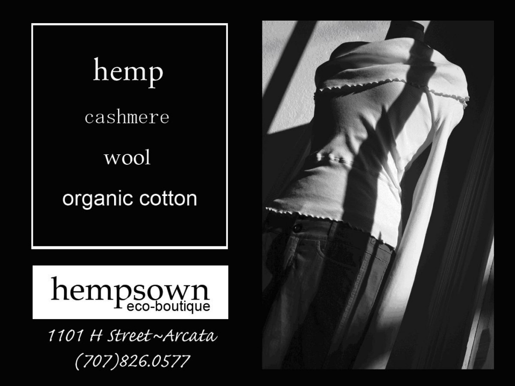
The forth ad has a good, sharp, high-contrast image that catches my photographer’s eye. “Hempsown” really stands out, though the other print takes some straining to read, especially “Cashmere”.
Sorry, but I’m not really impressed with the lot.
Tom
ex-east coaster, in NM for 7 years now, recovering engineer.
“The first two ads are such low contrast that I cannot read them, therefore they got skipped over.”
How is it possible that the 1st ad, which is black and white, could be any higher contrast? Bolder, yes, the lines are delicate, and the image is rather small, but it appeals to me the most. Tho, I’m not trying to read the handwriting, I don’t know if that’s important, I’m reading it as “texture”.
I would have to say the difficulties are my fault. I resized the images so the page would load quickly. I don’t have the files on this computer. When I get to work tomorrow, I’ll load the full size files and include hyperlinks so people can see them more readily.
sorry for the confusion.
I like the way cashmere is written in the last ad. It represents the feel and look of cashmere. I think that ad is the best one. Each of the fonts do represent the feel and image of the particular types/sources of fabric.
I think the first ad is very striking, too. Like Andrea was saying, the mood and visual of something is the most important thing, initially. I think the first ad really gets an image across. It’s classy, clear, and growing naturally.
I don’t particualrly care for the second one. It’s not quite as clear and doesn’t have a natural feel to it at all.
The third one also feels a little conflicted to me. At first I think, “James Dean”. Then I look at the setting and his shirt and think, “western”. Then, when I read “hip just got hot” the hip and hot make me think of “hip-hop” which is way to the other extreme again. His hat and expression are like Harry Connick Jr. Then, it throws in “high- end”. I just can’t figure that ad out at all.
I just LOVE the first and last ones, though.
Thanks, Andrea for all of your help. And, your post on the forum, too. I printed that one out so I could make notations on it.
Best to you!
I’m a little conflicted; I grew up in advertising – my Dad was a copywriter, so it was just a natural part of our background. I will wait to weigh in fully on the first two until I can actually read them – which automatically says something about the first two ads; I can at least get some idea of the product from the last two.
I can’t say that any of the campaigns move me greatly, except the third one, and that moves me away from the product. I don’t personally give a tinker’s damn as to what’s hot; I care about whether or not something meets my particular needs. Is the garment durable, attractive, well-made and suited to its purpose? At least the last ad gives me the idea that Hempsewn’s product may be made from a renewable resource which may also offer a touch of luxury. And as for what little I can read of the second ad, “I finally found something to wear!” – what, how many years has the “speaker” been running around naked? What has s/he been doing for pockets? How idiotic, and insulting. That’s an even more repellent approach than “Hip just got hot.” (And what on earth does “Hip just got hot” signify? In current jargon, “hip” and “hot” are virtually interchangeable. It would have been more accurate, more interesting, and more apropos to have said, “‘Hippie’ just got ‘hip.'”)
The most interesting effect of all four ads, in fact, is to leave me far less inclined to by something made of hemp than I ordinarily would. I LIKE the idea of hemp. I like the fact that it’s a fabric that has roots going back centuries, and has its fibre in the here-and-now. It was tough enough to make sails for the early explorers to sail around the world; surely it’s tough enough to make a pair of jeans that will last for more than a season. Tell me it’s a renewable, sustainable resource that can be as elegant as linen, as tough as sailcloth, and wreak less havoc on the environment than cotton. If your primary selling point is that the garments are “fashionable” and “current,” well, you still need a campaign that tells me why I should want them out of hemp, rather than another fibre.
The middle two ads mostly tell me it’s a product for sheep – which makes me inclined to say “Bah.”
Hi Andrea,
thank you for the time and effort you are spending on your advertising series for us.
Regarding the 4 hangtags/postcards (I am assuming that’s what they are)
The first and second tags don’t provide any info about the product to me, other than “hemp” and “eco-“, which immediately scream “earthy-crunchy-woodstock”. The image I get is baggy clothes, bare feet and protests (that’s the cynical east coast city girl in me). I tried reading the writing, but realized it is intended as backgroung-it looks nice, but I couldn’t keep myself from reading it anyway. On the second tag, I was trying to “see” a dress or garment in the background picture – though I think it’s just artwork.
The third turns me off because I see a creepy guy in a western shirt holding a bolero(?). To me, it screams country western. The “hip is hot” and “high end” conflict with the image the model was conveying. It may be a regional thing. I suspect this would appeal to a market other than the northeast. I think it is more my views on seeing men in ads. They always seem creepy when they look like they’re trying to capture a mood.
don’t give up on me yet..
the fourth ad does what you told us a successful ad should do ! (for me anyway) – It makes me want to find out more about the product despite my objection to the “earthy” clothing culture (yes, I think it’s more than just a market niche, it’s a way of life that is admirable – I just can’t subscribe to it):
1) It lists the fibers other than hemp! (is hemp linen?) anyway – I like cashmere, wool and cotton too – and if hemp is kinda like linen, I think listing linen as a fiber would widen the audience as linen garments are so desirable yet hard to find
2) It gives me a picture of the product! And although I’m not crazy about the top, the little bit of the pants that were captured in the photo appeared stylish and not baggy and not so “earthy crunchy”. I can picture them on me and I want to see more!
3) The photography made this ad. Although I am obviously not a fan of the hemp-clothing market, the photo was edgy and modern and simple and clean, that I am thinking, maybe they have something for me. I am curious, I want to find out more.
Well, I finished my assignment. Thank you again, and I hope I did not dis-respect the hemp folks-it centainly is not my intention, but it just honestly is not my cup of tea, yet I may be converted by the fourth ad.:)
noel
Noel, hemp is a plant fibre, derived from the cannabis plant – one of several plant fibres used for textiles (the most famous, of course, being cotton, from the cotton plant; the oldest western plant fibre being linen, from the flax plant; and the most recently known in the West, ramie, from the Asian plant of the same name [LONG history of use in Asian countries, like linen for the West]). Hemp was often the source of sailcloth, and can be used for making anything the other plant fibres can make, whether it’s clothing, rope, sailcloth, etc. It can be used alone or in combination with other fabrics. For a particularly delectable combination, my money’s on Dharma Trading’s hemp/silk combination: http://www.dharmatrading.com/html/eng/3584-AA.shtml?lnav=fabric.html . Dharma Trading offers a small selection of really nice fabrics, at decent prices; they offer a hemp canvas, a summerweight hemp, and a nice hemp/cotton knit. There are silks, linens, rayons and cottons available as well, including silk ribbon (bias and woven). Dharma Trading started, I think, by catering to the custom dye trade, but as far as I’m concerned, they’re a nice ethical source of some really nice fabrics.
Hemp definitely is a correspondent to linen, and is worth a look. It can be woven or knitted, like linen or cotton or ramie, it can be spun into textiles coarse and sturdy enough to bag potatoes, or a gossamer weight, and it can be tailored according to the ability of the person handling it, with a result like an Armani jacket, or a result like … granola. Hemp can put in an appearance as refined as anything Lauren, Kors, et al., would tailor; it depends on the effect desired by the manufacturer. It doesn’t have to automatically mean “baggy fit, wear with Earthshoes.”
I agree with most posts here about the fourth ad being the best in terms of conveying emotion while delivering the impact…and telling me something I may not have known. Definitely would be more moved to check out the wares based on this ad than on the others.
My goofy side just wants to put conversation bubbles above the guy’s head with things he might be saying/thinking….and none of them are repeatable here. :)
Thank you LaBelladonna for the information and history on hemp. I thought it was in the linen family. I have a hard time finding nice linen, maybe I will check out the hemp fabrics at Dharma-thank you for that insight!
This really has been a fun exercise, I have been giggling reading some of the posts, particularly regarding the ad with Mr. Hip-Got-Hot. I hope Andrea’s friend takes no offense at our reactions – it has been well intentioned and good fun and helpful for those of us who will be in that situation soon.
by the way….I thought that plant looked familiar!
I like the simplicity and high contrast of the first ad, but it’s a bit small. “Eco-boutique” gets one’s attention, but the text at the bottom I’m seeing (as Erin said) as texture, ergo there’s no real information other than the name & “eco-boutique”. Perhaps I’ll change my opinion once we get big images. :)
2nd Ad – Nice concept with the “flow of thoughts” (need a better word) text, but the background is too busy and again, the text is read as “texture”. I think this would work better if:
– the background became more faded/low contrast in order to *better* contrast with the text
– the “flow of thought” text became a background element and some more direct primary text (in cleaner lettering) was added as an overlay or to the right of the “flow of thought” lettering. In other words, plain text that states what the shop offers *you*, and the extra lettering is background information about this person who is thrilled about this shop
Ad #3: No real opinion since I’m not keen on what pulls men into menswear shops. It seems a little bland and typical “small boutique puts out an ad” to me, but I’m not necessarily the best person to ask.
Ad #4: A little bland maybe, but it gets across the point that this is a clothing store, it focuses on natural-fiber fabrics, and it’s ecologically aware. I think the other ads might be spicier, but this one does convey who you are and what you sell, which is hugely important!
Oh – and I like the placement of the address & telephone # on the ads – it’s not obtrusive but it’s easy to find.
I’ve amended the entry to include links to the full size jpegs.
Hey Guys:
I am really impressed! You all did a great job dissecting the ads. I have to admit some of you were a little hard on me (I made all the ads including all the photography), but that’s what I wanted you to do. Not all ads work for all people and as critics and future advertisers you must know why you like or don’t like something. Another piece to this puzzle that I didn’t emphasize enough in this post was the context of the advertising. These ads were all placed in an entertainment publication whose primary demographic is men and women ages 24-35 inserted into the daily newspaper. They were also placed in an alternative weekly publication (same demographics…different way to reach them). As follow up, her business has seen an increase in sales by 2/3 in 5 weeks.
Thanks for all your feedback and I hope this post has helped you guys think more critically about what you see/experience!
Hi all,
It always help me to actually put my thoughts about an ad into words. Which is why my friends always turn off the tv when the commercials come on!
I like the simplicity and elegance of the first ad (creating a mood of who the customer would want to be) and I think it works well with the image in the last ad. The detail in the last ad make it a good conclusion to a series. The other two don’t seem to fit the series, the second ad being a bit cluttered and not monochromatic like the others. And the men’s one, I agree with Carissa that there seems to be too many themes.
I am however very glad that it worked so well for Jennifer! And thank you so much for this series. I find it much easier to break down the whole overwhelming marketing task now!
And I think this shows up
I think Mr. Hemp-Is-Hot would do well in the Austin market. No fear of western-fusion styles there.
The first ad appeals to me visually, but doesn’t tell me much. The second one does nothing for me. I actually like the third one because it acknowledges that hemp has traditionally been granola, but there are people actively trying to get away from that. I appreciate that. I like the last one for the same reason.
The last two highlight a difficulty that we deal with in our marketing/branding strategy. We use sustainable fibers and fair trade practices. However, we also produce very high quality products. We want people to buy our products because they’re the best designs and quality. And oh, by the way, you can feel good about the purchase on all of these other levels, too. If we’re too overt about the sustainability aspect, we’re going to limit ourselves to the granola niche. If people feel they’re paying a higher price for brand name/quality/design, that’s one thing. But if they feel they’re paying that price for sustainability only, we lose a big part of the market.
We have been modeling ourselves after Patagonia, in this respect. The very best products in their category – and oh, by the way . . .
Andrea,
I think you did a great job on all the ads. Now that you divulged where you ran them it makes a bit more sense.
My thoughts were that all 4 ads were very presentable, although the ads with the photography
had more of an impact for me.
All of your ads in my opinion conjured up curiosity as to what an eco-boutique is. Is that not an important function of any advertising campaign ?
I suppose success is measured by sales results. An increase in business of 2/3rds is amazing, in a span of 5 weeks, no less.
What type of follow up campaign is planned to sustain these results ?
I’ve been thinking again, scary, I know.
I guess we could start a discussion on the forum where we could submit our website, hang tags, etc. for critique. I’m sure Andrea did learn a lot from this. The comments were all specific and professional. I thought maybe more of us could get critqued?
Irv:
These ads were kind of mish moshed…some of them went in succession and the Hip-is-hot guy ran for 3 weeks to introduce menswear. The next leg of Jen’s campaign is going to be geared toward holiday sales and getting prepared for her custom bridal season which I am happy to announce is shaping up wonderfully. Thanks again for the feedback.